Ah, the famous CTA. Three letters that snap and snap hard in the jargon of digital marketing. If you thought CTA stood for “Cable TV Authority” or “Cardiac Triage Area”, you’re not entirely off the mark… but you’re not on the right track either!
In our 100% web universe, CTA stands for Call-To-Action: a prompt that tells your visitor what to do next.
And the reason we talk about it so much is that it is simply one of the pillars of any inbound marketing strategy. Discreet yet decisive, this little button (or link, or image) is the tipping point between the visitor who wanders… and the one who clicks. So, ready to dive into the world of CTAs? Let’s roll.
What is a call to action (CTA) and what is it for?
A CTA, or call to action, is a clickable element that prompts the user to take a specific action. It might be a “Buy now” button, a “Download the free guide” link, or a simple phrase like “Sign up to our newsletter”.
Its goal? To turn a visitor into a prospect, then into a customer. To encourage contact, trigger a sign-up or an online sale, while guiding the user through their browsing. It’s a strategic milestone in the conversion funnel, the one that turns attention into interaction, and interest into commitment.
In other words, the CTA is the digital equivalent of “Shall we head to the till?”. It steps in at key moments to make taking action easier, whether that’s filling in a sign-up form, getting a demo or clicking that famous button that says out loud what marketing is thinking quietly.
It’s the keystone of visitor conversion in the conversion funnel.
But careful, no magic without strategy: a good CTA isn’t just pretty or visible. It has to answer a clear value proposition, be well worded with an action verb, and sit in the right place (the eternal question of CTA placement).
CTA: the different types of call to action
There isn’t just one type of CTA, but a real toolbox to pull out depending on the context, the medium and how far along the buying journey the visitor is. Here are the most common, and above all the most useful:
- Text CTA: the most discreet but often very effective. Slipped into a paragraph like a ninja, it takes the form of an underlined link such as “click here to find out more” or “discover the full study”. Ideal in a blog post or an email.
- Button CTA: the classic you can’t do without. It’s the clearly visible, well-contrasted call button, often with a clear action verb (“Buy now”, “Subscribe”, “Book my place”). It’s generally placed in the right spot to maximise the click-through rate.
- Image CTA: a clickable visual, often a banner or an illustrated box that catches the eye. Perfect for an ad block or a product highlight in a sidebar.
- Animated CTA: a visual CTA that moves a little, without tipping into GIF overdose. It can pulse, appear on scroll, bounce slightly… The goal? Grab attention without annoying. Very useful on mobile where space is limited but attention is precious.
- Dynamic CTA: the button’s level-up. It adapts to the visitor’s profile, history or behaviour. Example: a new visitor sees “Try for free”, a logged-in user sees “Go to your dashboard”. It’s personalisation in action.
Each type of call to action serves a specific use. Depending on the medium (website, newsletter, landing page, product page…), you’ll choose one or the other, or a well-thought-out combination. And as always, every CTA deserves to be personalised, tested and optimised. Because yes, what works for an article may do nothing on a landing page.
And after the click? That’s where the adventure of performance analysis, A/B tests and CTA optimisation begins.
Examples of effective CTAs (and where to find them)
On a website
- Homepage: “Discover our offers” (a visual CTA at the top of the page).
- Product page: “Add to basket” or “View the technical sheet”.
- Landing page: “Download the white paper” or “Book a demo”.
In an email
- “Sign me up for the course”
- “Read the full article”
- “Get today’s offer”
On social media
- “Watch the video”
- “Share your opinion”
- “Grab the offer before tonight”
These CTA examples work because they set out a clear prompt to act, with a benefit that is perceived immediately.
How do you create an effective CTA?
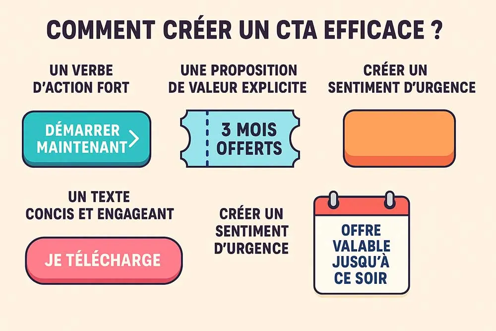
You don’t create a call to action at random, just as you wouldn’t throw a lifebuoy without aiming at the swimmer. Here are the key ingredients for a CTA that (really) converts:
- A strong action verb: It has to trigger an immediate impulse, getting the visitor to act, as the name suggests. Use verbs like: Download, Book, Discover, Access, Try, Start now. The clearer it is, the more readable the intent. Ban the limp wording such as “Click here” (unless it’s extremely contextual).
- An explicit value proposition: The visitor must understand at a glance what they get if they click. No mystery, no guessing games. “Get your free quote”, “Reserve your place for the webinar”, “Get 3 months free”. It’s this clear benefit that triggers the action.
- A contrasting colour: The button should stand out like a pink marshmallow in a bowl of rice. Respect the brand guidelines, but choose a colour that catches the eye and clashes with the rest of the content (without flashing like it’s the 2000s).
- Concise, engaging text: A good CTA gets straight to the point. 2 to 5 words are enough for most uses. “Download now”, “Free trial”, “I want to boost my sales”. The ideal? Write as if you’re speaking directly to the user.
- Create a sense of urgency or scarcity: Because humans procrastinate, give them a good reason to act right now. “Offer valid until tonight”, “Only 3 places left”, “24 hours to take advantage”. Urgency in a CTA, well dosed, adds punch to the decision.
And let’s not forget that behind these choices lies real thought about UX optimisation and CTA design optimisation. Everything must be smooth, logical, pleasing to the eye and, above all… effective at getting your visitors to act.
Where should you place a call to action to maximise its impact?
The eternal question of CTA placement! There’s no absolute rule, but a few best practices for getting the visitor to act on your page:
- CTA above the fold: visible without scrolling.
- CTA at the bottom of a sales page: after the sales pitch.
- CTA in the header or sticky menu: to stay accessible.
- CTA after an informative section: when the user is convinced.
- CTA in a sign-up form: to confirm the action.
The placement should follow the logic of the conversion funnel and be designed around the psychology of the click to push people to act.
Best CTA practices to boost your leads
- Run A/B tests: change a word, a colour, a position. The results are sometimes surprising!
- Adapt the CTA to the device: mobile, tablet and desktop = different behaviours.
- Look after the design: a misaligned CTA is a click flying away.
- Don’t drown the CTA: one main goal per page!
- Think about CTA user experience: smooth, intuitive, engaging.
- What if your button did a little more than blink? Some call buttons go further with a light CTA animation (pulse, discreet bounce, animated arrow…). The aim? To create subtle user interaction, without turning your site into a Christmas tree. Always think of the hesitating cursor: a small, well-judged movement can tip the balance.
CTA, segmentation and personalisation: the winning combo
A good call to action is good. A CTA personalised to visitor segmentation is better.
Example:
- A newcomer sees “Discover our services”.
- A regular sees “Enjoy 10% off your next order”.
CTA personalisation lets you adapt the prompt to act to the visitor’s behaviour, history or profile. That’s where content strategy meets the performance project.
CTA and performance analysis
A CTA without tracking is like a message in a bottle. You need to be able to follow every action your visitors take on a page.
What do we track?
- Click-through rate (CTR)
- Post-CTA conversion rate
- Bounce rate after the click
And from there, we adjust: wording, design, placement… that’s the whole principle of CTA optimisation.
The last word (or this article’s CTA?)
You’ve got the picture: a call to action is not a little accessory button. It’s a strategic lever, a real superhero of digital marketing, with the power to turn a curious visitor into a red-hot prospect.
Mastered, it boosts your click-through rates, structures your conversion funnel, and becomes the secret weapon of your user experience.
So, ready to take action?
(Psst… this would be the perfect moment to place a nice “Contact Web Opteam to boost your conversions!” button.)