You have traffic. Your Google Ads campaigns are running. Your social media posts are generating clicks.
And yet your visitors land on your website and leave without taking any action. Your conversion rate is flat. Your leads aren’t taking off.
And your advertising budget goes down the drain with every click that doesn’t convert.
The problem is probably not your offer. It’s that you’re sending your traffic to the wrong place (your home page, your product page or, worse, a blog article) instead of a landing page designed specifically to convert.
Using a dedicated landing page is one of the simplest and most impactful decisions you can make to increase the return on your advertising investment.
An effective landing page is the difference between a visitor who leaves and a prospect who acts. It’s a web page designed exclusively to achieve one specific action: download an ebook, sign up for a newsletter, request a quote, buy a product or register for an event.
One page, one goal, one call to action. Simple in principle, formidable in results. Landing pages play a central role in any digital strategy, from search engines to e-commerce websites and social media campaigns.
In this complete guide, we explain it all: the definition of a landing page, how it differs from a regular page, the types of landing pages, the key elements that convert, the steps to create one and optimisation best practice. Whether you’re an entrepreneur, a digital marketing manager, a freelancer or an agency, you’ll leave with a clear vision for building landing pages that really convert.
Landing page: definition and concept
What is a landing page?
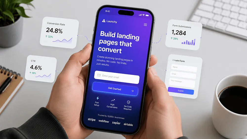
A landing page (also called a destination page or a lead capture page) is a web page designed specifically to convert visitors into prospects or customers. It’s the page on which a user “lands” after clicking a link: a Google Ads ad, a social media post, an email, an advertising campaign or an organic search result.
The most precise landing page definition is this: a single-goal web page designed to prompt the visitor to take one specific, expected action: fill in a form, download content, sign up for a service, buy a product or contact the business.
Every element of the page (headline, visual, text, form, CTA button) is designed and organised for this single purpose: converting visitors into qualified prospects or customers. The landing page therefore stands apart from all the other pages of a website through its single-goal logic and its clean user experience, designed to remove any friction on the path to conversion.
The landing page plays a central role in any inbound marketing and lead generation strategy. It’s the conversion point of the marketing funnel, the precise moment when an anonymous visitor becomes an identified prospect, ready to enter a sales or follow-up process.
On search engines and social networks alike, landing pages play a decisive role in turning traffic into measurable results.
Landing page vs home page: the fundamental difference
Confusing a landing page with a home page is one of the most common mistakes in digital marketing. These two types of web pages have fundamentally different goals and structures, and mixing them up costs you dearly in conversion rate.
The home page of a website has a broad, multiple purpose: introduce the business, its products and services, guide visitors to the different sections of the site and give an overall picture of the brand. It has a full navigation menu, links to many different pages and a multi-goal structure. It’s the general shop window of your online presence.
A landing page, on the other hand, has a single, precise goal. It generally has no navigation menu, to avoid any distraction that could pull the visitor away from the desired action. Every element of the page is designed to guide the visitor towards one action: clicking a button, filling in a form, downloading content or making a purchase.
That’s why landing pages, when well designed, have a much higher conversion rate than a standard home page.
Where the landing page fits in the marketing funnel
The landing page is part of a marketing funnel logic: the funnel that gradually turns an unknown user into a loyal customer. It generally comes after a traffic-generating action (advertising campaign, email, social media post) and before the final conversion (purchase, sign-up, contact).
In inbound marketing, the landing page is the conversion tool par excellence: it captures prospects’ details (name, email address, company, need) in exchange for added value (ebook, guide, free quote, free trial, webinar access).
This data then lets the sales team or the marketing automation software nurture the relationship with the prospect through to the sale.
A good digital marketing strategy includes several landing pages matching the different phases of the buying journey and the different maturity levels of prospects: awareness pages at the top of the funnel, consideration pages in the middle, and direct conversion pages at the bottom.
Each landing page must have its own layout, its own specific call to action (CTA) and its own expected action, consistent with the customer platform and the acquisition channel used. Website creation and landing page creation are two complementary approaches: one builds your online presence, the other makes it profitable.
Types of landing pages
The lead generation landing page
The lead generation landing page is the type most used in B2B marketing and inbound marketing strategies. Its main goal is to attract new qualified prospects and collect their contact details in exchange for a value-added offer: a downloadable ebook, a white paper, a practical guide, a themed newsletter, webinar access, a free training programme or a case study.
Downloading a useful resource is one of the most effective ways to generate qualified leads at scale.
The pattern is simple and effective: the visitor lands on the page, reads the value proposition, sees what they’ll get in exchange for their details, fills in the form and downloads or accesses the promised resource. On the business side, you collect the prospect’s data (name, email, company, job title), which feeds your CRM or your marketing automation software for personalised follow-up. Tools such as HubSpot make this integration automatic.
For example, a typical landing page of this kind: “Download our free guide: 10 strategies to double your conversion rate”. The catchy headline, the clear value proposition, the simple form (first name + email) and the highly visible CTA button all work together to turn the visitor into a qualified lead.
The sales landing page (click-through)
The sales landing page, or click-through landing page, is designed to convince the visitor to buy or to enter a sales process directly. It presents a product or service in detail, with its benefits, features and added value, before offering an action button that leads to a payment page or a quote request.
This type of page is especially used for free-trial campaigns (“Try it free for 14 days”), special promotions, product launches or limited-time offers. It’s designed to present the product or service directly to a prospect who is already in the decision phase, giving them all the information they need to act without having to browse the whole website.
The sign-up landing page
The sign-up landing page is used to generate registrations for an event, a webinar, a training programme, an online community or a free software trial. It clearly shows what the visitor is signing up for, the benefits they’ll get and the steps of the sign-up process.
This type of landing page is often followed by a thank-you page: a page displayed after sign-up to confirm the request, give practical information (date, connection link, access to the resource) and suggest a further action (share the event on social media, subscribe to the newsletter, discover other resources).
The advertising landing page
The advertising landing page is specifically designed to go with a paid ad: Google Ads, Meta Ads, LinkedIn Ads or any other social media advertising campaign. Its main characteristic is absolute consistency between the ad message and the page content: if your Google Ads ad promises “a free SEO audit in 24 hours”, your landing page must immediately confirm that promise, with no detour or distraction.
This consistency, known as “message match”, is one of the most decisive factors in the conversion rate of an advertising landing page. A visitor who clicks on an ad and lands on a page that doesn’t exactly match what was promised will leave straight away, raising the bounce rate and wasting your advertising budget.
The key elements of an effective landing page
The catchy headline: grab attention in seconds
You have between three and five seconds to grab a visitor’s attention on your landing page. If your headline isn’t immediately catchy, clear and relevant, the visitor leaves, however good the rest of your page is. The headline is the most important element of your landing page, and it deserves special care.
A good landing page headline must instantly answer the visitor’s questions: “Am I in the right place?” and “What’s in it for me?”. It must be clear, precise and focused on the benefit to the visitor, not on the features of your product or service.
“Double your traffic in 30 days” is catchier than “Our advanced SEO solution”. “Get your free quote in 24 hours” is more effective than “Contact us”.
The subheading completes the headline by adding a little more detail or context. Together, headline and subheading should be enough to communicate the main value proposition of the page in a few words.
The value proposition: get straight to the point
The value proposition is the heart of your landing page. It answers a simple but essential question: why should the visitor take the action you’re asking for? What will they gain by filling in your form, downloading your ebook or buying your product?
An effective value proposition is clear, specific and benefit-oriented. It avoids jargon, gets straight to the point and speaks the language of your target persona. It must be visible immediately, ideally above the fold (the area of the page visible without scrolling), so the visitor understands within seconds what you’re offering and why it’s useful to them.
The visual: an image or video that reinforces the message
The visual on your landing page (main image, presentation video or illustration) plays an important role in how your offer is perceived and in visitor engagement. A well-chosen visual instantly reinforces the page’s message, illustrates the promised benefit and creates an emotional connection with the visitor.
Video is particularly effective on landing pages: it can explain a complex offer in seconds, show a product in action or present a customer testimonial in a lively, engaging way. Landing pages with a video generally have a higher conversion rate than those without, provided the video is short, relevant and well produced.
The form: simple and optimised
The form is the central element of a lead generation landing page. Its design (number of fields, type of information requested, placement on the page) has a direct impact on the conversion rate. The golden rule: ask for the minimum information needed for your goal.
A form with only two fields (first name + email) always converts better than a form with ten fields. Every extra field is a friction point that lowers the conversion rate. Only ask for what you really need; you can always collect more information later, once the relationship with the prospect is established.
Set up your form to integrate automatically with your CRM or marketing automation tool (HubSpot, Brevo, Mailchimp) so the collected data is immediately available for sales follow-up with no manual handling.
The CTA (Call To Action): the button that converts
The CTA button (Call To Action) is the trigger for conversion. It’s the button the visitor clicks to take the desired action: “Download now”, “Get my free quote”, “Start the free trial”, “Register for the event”.
The wording of the CTA is crucial. Avoid generic wording (“Submit”, “Click here”, “Confirm”) in favour of value- and action-oriented wording (“Get my free guide”, “Start my trial”, “I want my SEO audit”). A well-designed new CTA can on its own generate a significant increase in conversion rate. It’s one of the simplest elements to change, and yet one of the most impactful.
The room for improvement is often considerable, even on landing pages that have been live for a long time. Designing a CTA suited to your target audience and your market is one of the first things to work on to maximise your results online.
Social proof: testimonials and trust signals
Social proof is essential to convince hesitant visitors. Testimonials from satisfied customers, case studies, verified reviews, logos of partners or client companies, figures and certifications: all of these reassure the visitor and lower their resistance to acting.
A well-chosen testimonial, with the customer’s name, job title, photo and company, is far more convincing than a generic claim about the quality of your offer. It humanises your proposal, creates identification and gives the visitor proof that other people like them have benefited from your product or service.
No navigation: remove the distractions
One of the fundamental principles of an effective landing page is the absence of a navigation menu. On a standard web page, navigation lets the user explore the site freely. On a landing page, that freedom to navigate is a distraction that pulls the visitor away from the desired action.
By removing the navigation menu, outgoing links and any invitation to explore other pages of the site, you force the visitor to focus on a single choice: take the proposed action or leave the page. This approach may seem radical, but it’s one of the first recommendations in landing page best practice, and its effects on the conversion rate are measurable.
How to create an effective landing page
Step 1: define the goal and the persona
Before creating anything, define precisely the goal of your landing page: what is the single action you want the visitor to take? And who is your ideal visitor, your persona, whose attention you want to capture?
These two questions are fundamental. Without a clear goal, your landing page risks trying to do too much and doing nothing well. Without a precise understanding of your persona (their needs, expectations, obstacles and motivations), your message will lack relevance and your conversion rate will be disappointing.
Step 2: choose the structure and the template
Once the goal and the persona are defined, choose the structure of your landing page. Several proven templates exist depending on the type of page and the goal. For a lead generation page: headline + value proposition + visual + form + CTA + social proof.
For a sales page: headline + value proposition + features and benefits + testimonials + CTA + guarantees. For a sign-up page: headline + description of the event or programme + benefits + sign-up form + CTA.
Tools such as HubSpot, Brevo or Unbounce offer pre-configured landing page templates optimised for conversion that you can customise to your needs, without requiring advanced web development skills.
Step 3: write the content and set up the elements
The writing of your landing page content should be guided by a single principle: every word, every sentence, every element must help convince the visitor to take the desired action.
No filler, no jargon, no unnecessary detail, only what’s needed to communicate the value of your offer and overcome the visitor’s objections.
Write a catchy headline, a clear and precise value proposition, a short list of the main benefits, a social proof section with testimonials or key figures, and a CTA worded to create a desire to act. Then set up your form, your CRM integrations and your thank-you page.
Step 4: optimise for mobile and speed
More than half of web traffic comes from mobile devices. Your landing page must be perfectly optimised for small screens: text readable without zooming, buttons big enough to tap with a finger, a form that’s easy to fill in on mobile, and light images for fast loading.
A landing page that takes more than three seconds to load loses a significant share of its visitors before they’ve even seen its content.
Tools for creating a landing page
Many tools are available to create landing pages easily without advanced web development skills. HubSpot offers a landing page builder integrated into its CRM, which automatically connects forms to prospect data and adds email follow-up workflows.
Brevo (formerly Sendinblue) offers a complete solution for creating landing pages and email marketing campaigns, with the option to send automated sequences consistent with your inbound strategy. Unbounce is a platform specialising in landing page creation with advanced A/B testing features and valuable help in measuring the impact of each change.
Webflow lets you design bespoke landing pages with a high level of customisation. On WordPress, plugins such as Elementor or Divi make it easy to build landing pages without coding, with a call to action you can configure in a few clicks from the app.
Optimising and testing your landing page
A/B testing: the method for continuous improvement
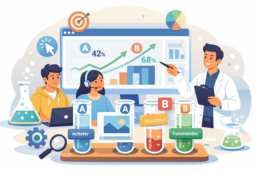
A/B testing, or split testing, is the benchmark method for optimising a landing page’s conversion rate. It consists of creating two slightly different versions of the page (version A and version B) and serving them at the same time to equal portions of your traffic, to identify which one generates the best conversion rate.
By using a landing page as an experimentation ground (testing, measuring and publishing the winning versions), the best marketing teams get lasting results. This approach lets you gradually increase the conversion rate and get the most out of your advertising budget, whether you rely on organic search through search engines or on paid campaigns.
Building a high-performing site also means knowing how to create and optimise landing pages continuously: it’s not a one-off action but a permanent improvement process.
The elements most commonly tested in landing page A/B tests are the headline (different wordings), the CTA (colour, wording, placement), the visual (image vs video, different visuals), the form (number of fields, order of questions) and the value proposition (different angles).
Test one element at a time so you can clearly attribute changes in performance to the element you modified.
The metrics to track
To measure the effectiveness of your landing page and identify optimisation opportunities, regularly track these key indicators: the conversion rate (percentage of visitors who take the desired action), the bounce rate (percentage of visitors who leave the page without interacting), the number of forms submitted, the cost per lead (advertising budget divided by the number of leads generated), and the time spent on the page.
This data is available in Google Analytics, in your landing page tool (HubSpot, Brevo, Unbounce) or in your advertising platform (Google Ads, Meta Ads). Analyse it regularly and use it to make optimisation decisions based on data rather than gut feeling.
Common mistakes to avoid
Several common mistakes drag down landing page conversion rates. Offering several different CTAs on the same page dilutes the visitor’s attention and reduces the chances of conversion: one page, one action, one CTA. Using a generic headline that doesn’t speak directly to the target persona is a missed chance to grab attention immediately.
Asking for too much information in the form creates resistance, so stick to the essentials.
Not including social proof is a frequent mistake: without testimonials, reviews or credible figures, your landing page lacks credibility and trust. Not having an optimised thank-you page is also a missed opportunity: the page shown after conversion is an excellent moment to suggest a new action (sharing, another download, a meeting request).
Web Opteam: your agency for landing pages that convert
Our approach: strategy, creation and optimisation
At Web Opteam, we create landing pages designed to convert, not just to look good. Our approach always starts with strategy: defining the precise goal, identifying the target persona and choosing the structure best suited to the maturity level of the prospects being targeted.
We then write the content applying conversion copywriting best practice, design the visual to reinforce the message, and set up CRM and marketing automation integrations for automatic lead tracking.
Every landing page we create is then tested and optimised continuously, with regular reports on performance metrics (conversion rate, cost per lead, bounce rate) to make sure you get the best possible return on investment for every campaign.
An effective landing page is your best online salesperson
In conclusion, a landing page is not a web page like any other. It’s a conversion machine, designed with method, continuously optimised and aligned on a single goal. Without it, your traffic, whether it comes from Google Ads, social networks, an email campaign or organic search, is energy and money spent with no measurable return.
With an effective landing page, every visitor who clicks on your ad or link arrives on a page designed specifically to convince them to act. The headline hooks them, the value proposition convinces them, the form collects their details, the CTA triggers the action. Simple in principle, powerful in results.
The most important advice to remember: create, test, measure and keep improving. A landing page is never perfect on day one. It’s gradual, data-driven optimisation that makes the difference between an average page and one that turns your marketing strategy into a growth engine.
Ready to create your first landing page or to optimise the ones you already have? The Web Opteam team is here to help. Get in touch and let’s build the landing page that will change your results.