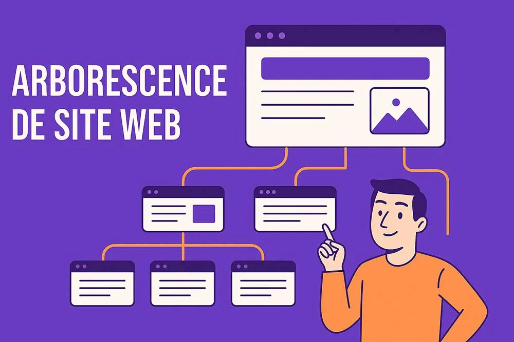
Imagine a website with no structure. It is a bit like a supermarket with no aisles, no signs, no shelves. Want to buy pasta? Good luck not ending up with dog food on the way. Your website structure is the map, the GPS, the battle plan that will guide your user (and Google) to the right content, at the right time.
Welcome to this complete (and slightly relaxed) guide to website structure. Whether you are an entrepreneur, a project manager, a student or a freelance designer looking for structure, you are in the right place.
What is a website structure?
Imagine a site with no structure: it is like a novel without chapters, a treasure map without a legend, an IKEA without arrows on the floor. In short, chaos.
Website structure is the way pages are ranked, organised and linked together, so that users (and search engines) can find their way around without a GPS.
It is a bit like the architecture of your digital home:
- The front door? The home page.
- The living room? Your main pages: services, products, blog.
- The side rooms? Sub-categories, product pages, articles.
- The floor plan? The navigation menu.
- The shortcuts between rooms? Internal links.
So we are talking about structure: which content sits at which level, what depends on what, how you move from one item to another… And all of this has to follow a UX (user experience) and SEO (organic search) logic.
In practice, an effective website structure rests on three pillars:
- Hierarchy: well-defined levels (home page > categories > sub-categories > content)
- Logic: pages are grouped by topic or by search intent
- Consistency: every element finds its place in the whole, like on a mind map
Thanks to this architecture:
- your menu is clear and easy to understand;
- your visitors do not get lost by the second page;
- your content is reachable in three clicks at most (the famous 3-click rule);
- Google understands how your site is structured and which key pages to put forward.
Want a metaphor to make it stick?
A website structure is like a well-organised library: you know straight away where the crime novels, the comics and the cookbooks are, and you do not have to browse every shelf to find what you want.
In summary (schematic, but stylish):
A structure = a thought-out plan
A thought-out plan = clear navigation
Clear navigation = happy users
Happy users = more time spent on the site
More time on the site = a happy Google
A happy Google = better rankings
Better rankings = more visitors
More visitors = more conversions
And all of that… thanks to a good website structure.
See the picture? Yes. Then let’s carry on.
What is a website structure for? Spoiler: lots of things (really)
You might think website structure is just about filing pages. But no, it is much more than that. It is a cornerstone of your web ecosystem, an optimisation lever for your whole digital strategy. Here is why it deserves all your attention.
To organise your web content logically (and keep your sanity)
You would not put your “Contact” page under “Men’s shoes”.
Nor would you tuck your FAQ away in a dark corner of the blog like a forgotten old archive.
Website structure forces you to think about the place of each element on your site. It is a strategic tidy-up, almost therapeutic.
It pushes you to categorise intelligently: a product goes in a category, a category has a clear purpose, every page serves an intent.
By structuring your content in clear hierarchical levels (home > categories > sub-categories > pages), you gain readability, consistency and flow. And spoiler: so does your user.
Concrete example:
You sell sportswear. You would not mix:
- Technical products (for example running shoes)
- Blog advice (for example how to choose the right shoes)
- Corporate pages (for example our team, our values)
You sort them. You rank them. And everyone wins.
To make navigation easier for users (and reduce the exit rate)
In 2025, the web user no longer has the patience to look for 10 seconds for a piece of information.
Navigation must be smooth, intuitive and reassuring.
A good site map is like a good road sign: you know where to go, what to expect, and you do not need a voice GPS to find your way.
Thanks to a clear website structure:
- Users can tell where they are (breadcrumb trail, menu, page title)
- They can go back or explore sideways without effort
- They get an overview of the site: everything is easy to reach
- They feel guided, not lost in a maze of pages
The result? They stay longer. They explore more. They click more. And Google, once again, loves it.
Web Opteam UX tip: you can check how smooth your navigation is by running a user test. Ask an ordinary person (your mum, your colleague or your intern) to find a specific page. If they struggle… your site structure needs a facelift.
To boost your SEO (and make Google go gaga)
This is one of the most powerful (and most underrated) impacts of website structure: it directly influences your organic search performance.
Why? Because:
- Google’s robots crawl your site like a map. The more readable it is, the faster they understand your topic, the structure and the logic of the pages.
- A good structure allows optimised internal linking: every important page receives strategic internal links, which increases its authority.
- Priority pages are put forward, indexed faster and rank better.
- The architecture also lets you target precise keywords at each level (categories = generic keywords; content pages = long-tail keywords)
SEO example:
If you have a page “women’s waterproof trail running shoes” but it is hidden in a corner of the site… it will never get the visibility it deserves, even if the content is great.
Web Opteam SEO tip: each level of your site structure can (and should) target a well-defined group of keywords. The structure then becomes a strategic map for positioning on Google.
To guide the user journey towards your business goal
A website structure is not just there to look good. It serves your conversion strategy.
Because yes: every click must be a step towards a goal:
- buy a product
- fill in a form
- sign up to a newsletter
- book a demo
- or simply stay longer to discover your brand
A good website structure must accompany the user from a point A (entry page, often the home page or a page coming from Google) to a point B (conversion).
Example of a smooth journey:
Home > Products > Category > Product page > Basket > Payment
…or
Blog article > “Download our guide” form > Email > Onboarding sequence
Each step is a page in your site structure. And every link must be designed to reduce friction, hesitation and blockages.
In other words: website structure is the attack plan for your conversion funnel.
How do you build an effective website structure?
No need to get out the machete, or to get lost in a maze of sticky notes. Building a website structure is like preparing a recipe: you need the right ingredients, the right utensils and, above all, a clear method. Here are the essential steps to create a structure that ticks every box: UX, SEO, conversion… and common sense.
Step 1: Define the main goal of your website to find the structure it needs
Before even thinking about pages or categories, take a moment to ask yourself THE founding question: what is the goal of your site?
The answer will shape the whole structure:
- Selling products? → you will need categories, sub-categories, product pages and a purchase funnel.
- Generating leads? → the emphasis will be on forms, calls to action and “services” pages.
- Informing or inspiring? → you will need a well-organised blog, topic pages and a good internal search engine.
- Showing a portfolio? → the hierarchy must guide the user through your projects, with clear filters.
Web Opteam tip: every business goal implies an ideal user journey. The website structure is there to make it real.
Step 2: List all the content to include in the site structure
Now that you know what you want to achieve, it is time to make a complete inventory of all the content your site must contain.
A. The main pages
These are the foundations of your site. They are often found in the main menu:
- Home
- Products or Services
- About
- Blog
- Contact
B. The secondary pages (but essential ones)
They are not the stars of the menu, but they have to exist:
- Legal notice
- Terms and conditions
- FAQ
- Testimonials
- Privacy policy
- Newsletter, guide download…
C. The category pages
If you run an ecommerce site or a blog, categories are the heart of your navigation:
- “Face creams”, “Solid shampoos”, “Essential oils”… for a beauty site
- “SEO”, “PPC”, “Content marketing”… for a digital agency
D. The detailed content
We go down a notch with:
- Product pages
- Blog articles
- Landing pages
- Sub-categories
Web Opteam tip: organise all this in a Google Sheet or in Notion with columns such as: page title, type (category / product page / article…), goal, parent link. You gain clarity and lay the foundations of your future site map.
Step 3: Group the content into categories (not at random)
Once the inventory is done, we move on to organisation.
Group each piece of content into a logical category, with a consistent hierarchy.
Each level of your structure must respect a precise search intent: do not mix the tea towels (corporate) with the napkins (products).
Ecommerce example:
Home
├── Products
│ ├── Shoes
│ └── Accessories
├── Blog
│ ├── Running tips
│ └── New equipment
├── About
├── Contact
Service business website example:
Home
├── Our services
│ ├── Website design
│ ├── SEO
│ └── Training
├── Blog
│ ├── Web marketing tips
│ └── Success stories
├── About
├── Testimonials
├── Contact
Key points:
- Every piece of content must have a “logical parent”.
- Never leave an orphan page (one with no link from any other page).
Each level matches a depth of navigation.
Step 4: Prioritise information (the brain of the website structure)
Not all pages are equal. Some must be reachable in a single click, others can hide a little further away.
Here is how to prioritise intelligently:
A. Direct-access pages (level 1)
These are the strategic pages, visible in the main menu:
- Home
- Product categories
- Services
- Contact
- High-conversion pages
B. Intermediate pages (level 2)
These are the sub-categories or important detail pages:
- List of products in a category
- Specific service pages
- Testimonials, “Why choose us”
C. Deep pages (level 3+)
These are the targeted content pages:
- Product pages
- Blog articles
- Help pages, terms of use, etc.
It is worth remembering that the aim is for all important content to be reachable in 3 clicks at most from the home page.
Practical example:
You want users to download your white paper?
Home > Blog > SEO article > Call to action > Form
…Perfect. 4 clicks, with logic and consistency.
But if your form is hidden in “About > History > File > Archives > Download”? Bad plan.
A concrete example of a website structure (simplified but telling)
Goal: selling natural cosmetics, ecommerce site
Home
├── Products
│ ├── Face care
│ │ ├── Cleansers
│ │ └── Moisturisers
│ ├── Body care
│ └── Gift sets
├── About
├── Blog
│ ├── Beauty tips
│ └── Ingredient spotlight
├── Contact
└── FAQ
In this structure:
- There are 3 levels at most
- Each link matches a clear intent
The navigation menu can mirror this hierarchy exactly
Tools for creating a website structure
You do not need to carve your plan in stone or call in a druid cartographer. Here are a few tools (free or freemium) that make your life easier when visualising, testing or presenting your website structure.
1. Mind-mapping tools
These tools are perfect for brainstorming and organising your ideas visually. They are not always web-focused, but they are very useful for designing the broad lines of a website structure.
- XMind: powerful and very flexible, it lets you create clear mind maps with several levels of depth. Perfect for laying out all your ideas.
- MindMeister: a collaborative online mind-mapping tool. Very handy for working with others on a structure in shared brainstorming mode.
- Whimsical: a gem of simplicity with a clean design. It lets you quickly build diagrams with icons, colours and links, all in a very UX-friendly way.
2. Tools dedicated to website structure
These tools are designed specifically for website structures, with features that match the reality of a digital project.
- Flowmapp: a reference for building sitemaps. Widely used by UX designers, it lets you visualise the user journey, add notes, personas, etc.
- GlooMaps: an ultra-simple tool for creating a structure in a few minutes. Perfect for quick web mock-ups or for validating a structure with a client.
- Octopus.do: probably the most “designed” of them all. It lets you create an interactive structure with page previews, content types, colour coding… and even HTML exports.
3. Good old PowerPoint (or Google Slides) also works for a website structure
Yes, we know, it is not very trendy… but it works. For a client presentation or an internal mock-up, a good slide with rectangles and arrows can be enough to explain the levels of your site. Quick, accessible to everyone and customisable at will.
In your articles and SEO content, include storytelling elements to make your messages more engaging. Share stories that resonate with the values and aspirations of your target audience. This can also help your content get shared more on social media and improve engagement.
The link between website structure, UX and SEO: a sacred alliance
You might think website structure only concerns “web technicians” or “people who like diagrams”. But in reality, it is a strategic bridge between two key disciplines: UX (user experience) and SEO (organic search). And spoiler: when UX and SEO work hand in hand, it is your site, and your conversions, that come out winners.
User experience (UX): website structure is the GPS
A good site is like a good shop: you know straight away where to go, you quickly find what you are looking for, and you do not leave frustrated.
Website structure directly influences the user journey:
- Which page do they discover first?
- Where do they click next?
- Can they easily go back?
- Do they have a clear view of what the site offers?
If the navigation is vague, labyrinthine or counter-intuitive, the user leaves the site. And you lose a sale, a lead, a subscriber: in short, an opportunity.
The signs of good UX thanks to a well-thought-out structure:
- A clear menu, with simple, understandable labels
- A logical structure, with consistent hierarchical levels
- Useful internal links that let people bounce from one page to another
- A visible breadcrumb trail, to always know “where you are”
Concrete example:
If your site sells tea, and a user is looking for an organic detox infusion, they should be able to go in a few clicks from:
Home → Products → Herbal teas → Organic Detox Infusion
No detour via “Our commitments” or “Our story since 1952”.
They are looking for tea, not your biography.
Web Opteam UX tip: have your navigation tested by someone who does not know your site. Ask them to find a specific page. Watch their hesitations. You will quickly see whether your structure is effective… or not.
Organic search (SEO): Google’s reading map is the website structure
Google is not just a search engine. It is a robot that reads your site. And like any reader, it needs clear landmarks, a common thread, a well-marked structure.
A well-thought-out website structure lets crawlers (hello, Googlebot) to:
- Crawl your pages more easily (this is called crawlability)
- Understand the relationships between your content (topics, sub-topics, related articles…)
- Identify the most important pages (the ones you really want to rank)
- Interpret the hierarchical levels (for example category page = generic keyword / product page = long-tail keyword)
Why does it matter?
Because a well-organised site:
- Avoids orphan pages (with no internal link)
- Creates optimised internal linking (every important page is linked to others)
- Distributes “SEO popularity” better between pages (through internal PageRank)
- Strengthens topical relevance (Google loves well-built semantic cocoons)
SEO example:
Take a site about hiking. A good structure would look like this:
Home
├── Hiking tips
│ ├── Equipment
│ ├── Physical preparation
│ └── Mountain safety
├── Top hikes
│ ├── France
│ ├── Europe
│ └── World
Each page covers one clear sub-topic. And thanks to internal links, an article on “the best hiking boots” can point to “how to choose a backpack” or “high-mountain hikes” → which improves the semantic consistency of the site.
A small (but solid) SEO tip
- Put the right keywords in the titles and URLs of your pages (without stuffing).
- Create internal links between complementary pages (for example a blog article → a service page → a contact page).
- Use smartly named categories and sub-categories: “Blog” is vague; “Organic beauty tips” is much better.
Bring strategic pages up in the structure (the less deep they are, the more visible and crawled they are).
UX + SEO = a winning combination
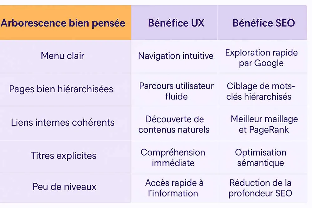
Website structure is the link between human and robot
Want the design of your site to please your visitors? Want it to climb up Google’s results? Then you need a solid, readable, intelligent architecture.
Because in the end: good UX attracts and keeps visitors. Good SEO attracts Google. A good website structure attracts both.
Best practices for an effective website structure
- Always start with an audit of your content
- Use simple words to name your pages (no technical jargon)
- Limit the number of levels to 3 (4 at most)
- Check that every page is linked to another page (no orphan pages)
- Keep semantic consistency (no “Products” category with a single product in it)
- Think mobile: a menu that is clear on desktop can become unreadable on a smartphone
Common mistakes to avoid in a website structure
- A structure that is too deep: if a user has to click 6 times to reach a product page, you lose sales (and hair).
- Vague or generic page names: “Section 1” or “Our various offers” help neither the user nor Google.
- An overloaded menu: want to show everything? Bad idea. Prioritise. Simplify. Breathe.
- Duplicate pages or content: one page = one goal = one URL.
- Ignoring user data: tools like Hotjar or Google Analytics can help you understand where visitors click… or leave.
In the end, building a website structure is like organising a house share
Every page must know where it sleeps. Every piece of content must have its room. And if a housemate (user) turns up unannounced, they should be able to find their bearings easily, make themselves a coffee (reach the content), and even recommend you to their friends (share the site, come back, buy…).
In short, a well-thought-out website structure lets you:
- make navigation easier
- organise information logically
- improve organic search rankings
- optimise conversions
So whether you are building a website from scratch or redesigning your existing site, the website structure is a crucial step. It will shape your success, your SEO, your UX… and your conversion rate.